Overview
The purchase of a new bicycle for cycling enthusiast is a task they take seriously. Users are picky and want top of the line bikes with the best features, so they do research and compare multiple bikes before committing to a big investment.
Business Goal
Cycle wants to improve the conversion from browsing bikes to completion of checkout in order to increase revenue on the product’s mobile-web experience.
Data shows that:
-
50% of users open 7 item pages on average and then abandon the site without moving any items into the cart.
-
70% of users who place an item in the cart do not purchase.
-
Users abandon the cart at the registration page.
Target User
-
Males who take biking seriously
-
Between 24 and 38 years of age
-
High income earners
Constraints
-
90 hours to complete the project
-
1 low fidelity deliverable, 1 high fidelity deliverable, and 2 rounds of user testing
Project Plan
Conducted competitive research to understand how users feel when interacting with competitor products.
Designed user flows, created low-fidelity wireframes as well as a high-fidelity prototype.
Conducted usability tests of the low-fidelity and high-fidelity designs to uncover usability issues and iterate on the design.
The Solution

Comparison of Product Feature
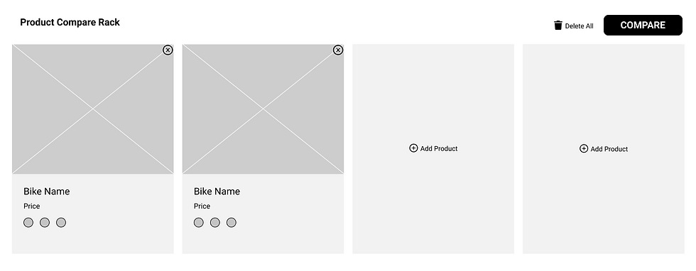
Allow users to compare the features of desired bikes with the option to highlight differences, hide and show information as needed, and a CTA to purchase the bike will decrease the amount of pages open and increase likelihood of purchase completion.

Guest Checkout
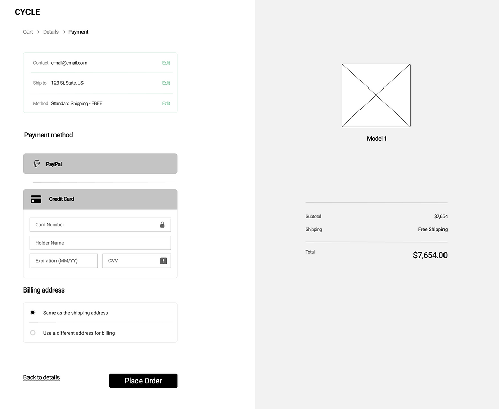
Instead of creating an account to complete payment, allowing users to checkout as a guest will allow the user to easily complete a purchase in Cycle and decrease the likelihood of users abandoning the website.
✷ Define
Competitive Evaluation
I conducted a competitive evaluation for two major bicycle companies and interviewed five participants to understand how users feel when interacting with competitor products on a similar purchase goal. I wanted to learn what features a user would like to have in order to make a decision to purchase an expensive product.
I learned that:
.png)
Key Takeaways from Competitive Evaluation Interviews
✷ Design and Validate- Low Fidelity
User Flow
Using the business goal provided and the feedback from competitive evaluations, I designed two user flows that would be included in Cycle's MVP.
-
Compare Relative Features and Add to Cart
-
Guest Checkout that Captures Email


Wireframes
Due to the time constraint, I decided to skip the sketches and jump straight in to low-fidelity wireframes to solve for the two user flows. Then, I created a prototype for usability testing that included a table where the user can add up to 4 bikes to easily compare their features and will prompt them to add it to their cart, as well as a guest checkout that can be completed in 2 steps.
Testing Wireframes
I conducted six usability testings with users who regularly shop on a website rather than mobile. The purpose of my wireframe usability test was to see if the routes that I designed would solve the business goals for Cycle, pinpoint confusing elements, and gain feedback from my testers to make improvements that will make Cycle more user friendly.
The tasks:
-
Compare two bikes from a category
-
Select a bike you would like to purchase
-
Complete payment for your selected bike
Main Learnings:
-
50% of users stated there were too many steps to get to checkout page.
-
"Compare Products" table had flaws such as: CTA Shop Now button was hard to find, pictures were too big leaving little space for information to show, and buttons under picture were distracting.
✷ Design- High Fidelity
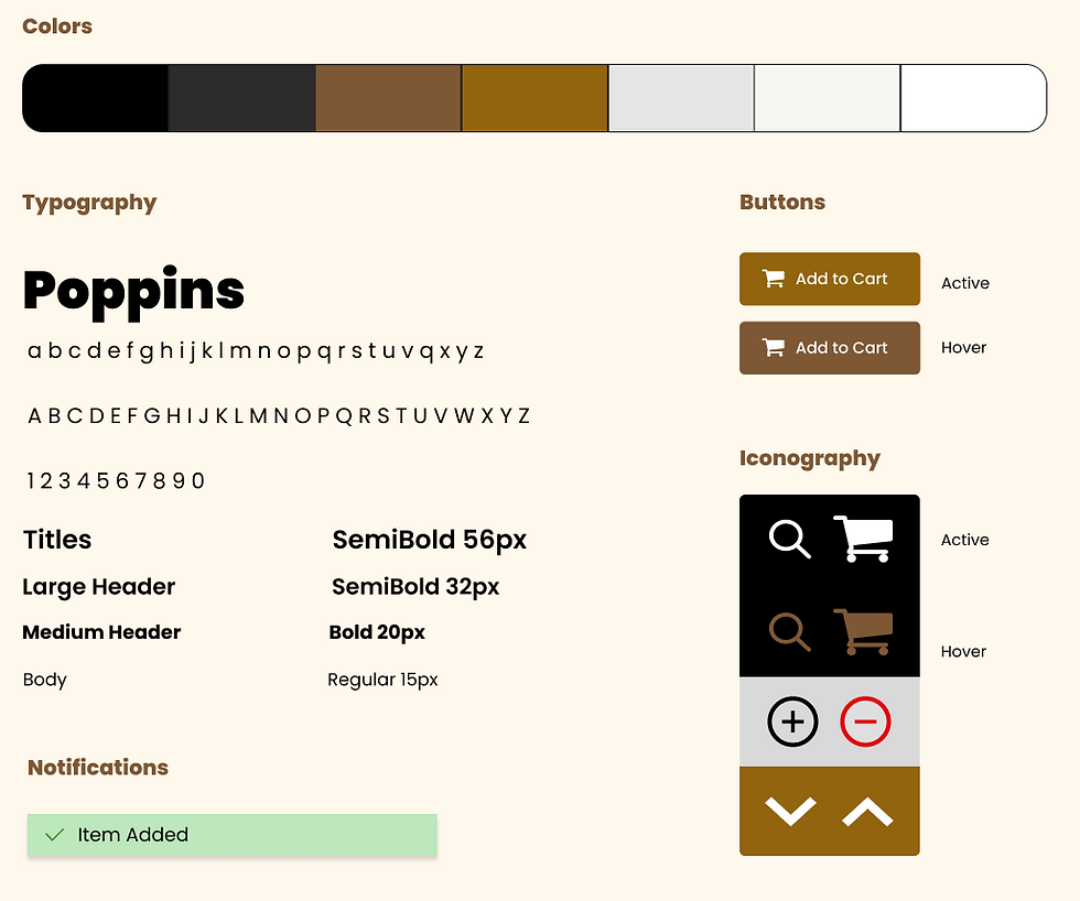
Style Guide
Brand personality — an expert in the field who is always knowledgeable about the very latest trends and best products related to biking.
Brand attributes — Savvy, Focused, Serious, Dependable
.png)
✷ High Fidelity Designs and Prototype
.png)
I created high fidelity prototypes for my website using the wireframes and the notes taken from the wireframes usability tests, following the design guide.
✷ Validate
Testing
The purpose of my high fidelity usability test was to see if users were able to successfully complete a purchase for a luxury bike by comparing two bikes and choosing their preferred one, adding it to the cart, and completing payment as a guest. Furthermore, to see if users enjoyed the UI of the website.
Testing was successful. All of the users where able to complete the tasks successfully; however, I found out two critical issues to be resolved in the next iteration to improve the look and functionality of the website to be aligned with Cycle's brand identity.
✦ Look and Feel of Bicycle Comparison Table
30% of users mentioned that the comparison table did not feel as elegant as the rest of the design.
I changed the look of the comparison table by decreasing row widths and text size, removing the outlines to create a more elegant, sleeker look, enabling the "Highlight differences" toggle, moving "Add to Cart" CTA below the image at the top of the page, and making the section static on the prototype, so that the user has access to it while reading all the features.


✦ Compare Bicycles Banner
50% of users had trouble distinguishing the Compare Bicycles and took longer to find the banner due to its similar color of the to background page.
In order to avoid confusion and make the banner more visible, I changed its color to the Gold Brown accent color. Moreover, I removed the outlines and added minimal shadows for a more sleek look, increased the overall size of the banner for more visibility, and change the wording for the CTA.
.png)

Iterations for Bicycle Comparison Table
Iterations to Compare Bicycles Banner
Wireframes for Cycle
✷ Final Prototype
✷ Takeaways
✦ Always Learning — This project provided a great opportunity for me to explore e-commerce and web design, as I had previously worked with mobile apps only. I had to familiarize and research e-commerce and web design before even attempting to ideate for solutions. I enjoyed the challenge of solving Cycle's business goals with the data given, the hypothesis from the Project Manager, and the time constraint. I received positive feedback from users about the website's functionality and its simple yet elegant design.
Previous Bicycle Comparison Table
Previous Compare Bicycles Banner
